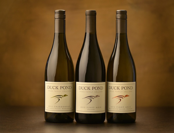
DUNDEE, Ore. — Duck Pond Cellars, one of the the largest brands in the Oregon wine industry, has given its 20-year-old bird a sleek new look.
“The ’90s were the era of the critter label, and people have a certain perception of that,” said Amber Fries, director of communications for Duck Pond, which celebrated its 20th anniversary this year in Dundee. “We feel our wines are better than some of the better-known critter labels, so we wanted a more modern and classic look that will let the wines speak for themselves.”
Duck Pond, ranked as Oregon’s No. 3 brand in terms of production for 2012, will officially unveil the new logo Friday in conjunction with the Wine Country Thanksgiving weekend. However, wine club members got a sneak preview during a ceremony Saturday afternoon.
 “We’ve never done a change quite like this,” said Greg Fries, president and director of winemaking and viticulture for the family business. “There’s been a slow metamorphosis from the original logo over the years, but we’ve never done a brand refresher.”
His father, Doug Fries, who launched the value-minded winery in 1993 after a successful farming career in California, said, “In order to succeed as a farmer and a businessman, you should be willing to take some risks and make some changes in order to better your business. Our new label look is a big change, but I think it’s a positive one.”
The redesign took 18 months and involved a fair bit of debate, the family said. The project was spearheaded by Amber, who is Greg’s wife, and Lisa Jenkins, Greg’s sister. Jenkins supervises the Duck Pond tasting room in Dundee as well as the family’s Desert Wind Winery in Prosser, Wash.
There are no plans to make over the Desert Wind brand, the family said.
Houlihan & Jones played role in redesign
 The Frieses consulted with Martin Jones of Houlihan & Jones in Sonoma throughout the process. Houlihan co-founded Barefoot Cellars in 1985 before selling the ubiquitous brand to E&J Gallo in 2005.
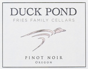
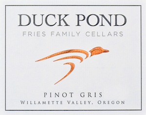
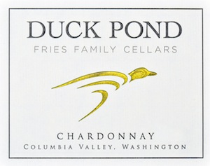
“The icon of the duck will be the same for all the wines,” Greg Fries said. “The old label had a different duck in a different color for different wines, but we didn’t feel the consumers could recognize the brand on the shelf as easily as we would like them to.”
The person who could be the most affected is Scott Jenkins, Lisa’s husband, who is the national sales director for the 50,000-case brand. He’s extended the reach of Duck Pond wines to 44 states and 20 countries.
“He was really ready for a more modern look to take out there, and he is very excited about rolling it out,” Amber Fries said. “We’ve shown it to our distributors and the reaction has been nothing but positive, and they are really excited to take it out there for us.”
 There’s a strong family connection to the brand name and the origin of the logo, which is a tribute to the neighborhood that Greg grew up in at Sunriver Resort in Oregon.
“I spent 11 years there at Duck Pond Lane, and my folks still have their house there,” Greg said. “They built it in 1982 and has been their residence since then. I was 10 years old, and that’s basically where I spent my adolescent years, from sixth grade through when I graduated from high school.”
He then went onto University of California-Davis, where he received a degree in viticulture and enology, and returned to Oregon to help his parents build their new wine.
The world of marketing and branding has changed during those two decades, and the Duck Pond logo has been a source of debate, Amber Fries said.
“It’s been a somewhat polarizing label,” she said. “Some people absolutely love it and will be disappointed by our move away from the critter label.”
Duck Pond to release 3 vineyard-designate Pinot Noirs
Duck Pond also is using the change as a way to better highlight its conservation efforts.
“We’ve been raising funds for the Oregon Department of Fish & Wildlife’s conservation habitat program, and we will be doing a special bottling for that,” he said.
The Fries family owns 1,017 acres of vineyards in the Pacific Northwest, with eight sites spread throughout Oregon and Washington. Next spring, the new logo will be used on the three single-vineyard designated wines that Duck Pond will release for the first time, featuring wines from Coles Valley Vineyard, the family’s young planting in the Umpqua Valley, as well as their more established sites near Salem — St. Jory and Willow Creek.
Ideally, the family would have rolled out the logo last spring in conjunction with the celebration of the 20th anniversary of Duck Pond Cellars, but the timing of the migration to the new look wasn’t right.
“The seven family members were involved with the design process because this is important for all seven of us to get behind this and take our brand to the next level,” Amber Fries said. “We all had to give a little something of ourselves in order to create something that could resonate with all of us.
“That’s why the process took so long, but we feel this is a really authentic look for us and hope that it will resonate with the consumer as well,” she continued. “It’s a huge change for us, and we’re all super-excited about it.”
Leave a Reply